Припустимо, ви – бренд-менеджер, і вам потрібна упаковка для продукту, який буде продаватися на полицях супермаркетів. Яким шляхом піти: графічний дизайн або малювання картинок, що подобаються власнику? І в чому різниця. Цілком мирне та земне бізнес-завдання розглянемо за аналогією із завданням військово-небесним.

Гагарінський скафандр СК-1 було виконано в помаранчевому кольорі, щоб швидше знайти космонавта під час пошукової операції. Брудно-зелене забарвлення висотно-компенсуючого костюма ВКК-6 (розробка 60-х років), навпаки – спосіб зробити льотчика-винищувача менш помітним, якщо він катапультується на ворожу територію.
Полиця супермаркету – це поле битви для товарів. Один з інструментів для досягнення успіху у вигляді попадання в купівельній кошик – кольорове рішення упаковки. Проектуватися цей інструмент має з огляду на поставлені бойові завдання.
Найпростіший приклад: хочемо привернути увагу покупців – проводимо колірну аналітику, вибираємо контрастні щодо конкурентів кольори. Продаємо в категорії, де прийняті певні кольори і виділятися особливо не прийнято – працюємо у відтінках категорійної палітри.
А якщо хочемо зниження ймовірності продажу – ігноруємо аналітику, принципи проектування, а кольори вибираємо наосліп – на підставі чиїхось думок, симпатій, фрагментарних знань про вплив кольору на психологію покупця. Але немає лиха без добра – в цьому випадку цілком можна утриматися від інвестицій в графічний дизайн і найняти будь-кого, хто вміє малювати.
Якщо ж вибір припав на агентство хоч і недешеве, але таке, що викликає довіру, то шанс заощадити все одно є. Наприклад, на кількості варіантів упаковки, яку вам покажуть на вибір. Оскільки у завдання завжди існує одна правильна відповідь. Навіщо оплачувати час дизайнерів, який буде витрачено на додаткові варіанти після того, як ідеальний з погляду профільних фахівців буде вже створено?
Наприклад, може бути тільки один колір рятувального скафандра, який краще за інших буде видно на тлі снігу/води/лісу та інших варіантів ландшафту. Або, навпаки, непомітний, якщо є таке завдання. Всі інші кольори – гри зі смертю.
Декілька слів про те, що ще найчастіше враховують при проєктуванні упаковки, щоб підвищити шанси на виживання:
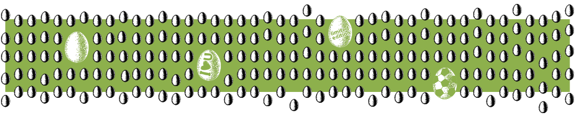
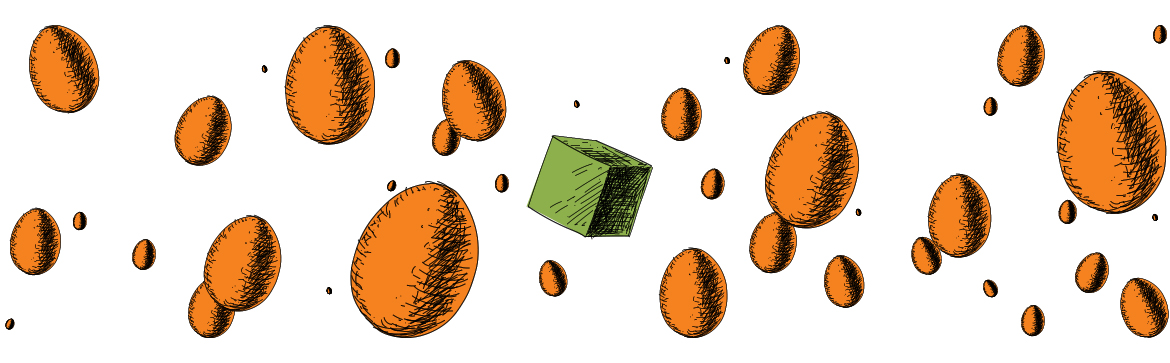
- форма – ви відразу помітите, умовно, квадратне яйце в лотку.
- принципово некатегорійне рішення. Набір якостей, які по суті абсолютно не відповідають завданню, викликаючи когнітивний дисонанс та інтерес. Наприклад, чорна упаковка для вершкового масла.
- розмір – ВЕЛИКЕ серед маленького. І навпаки. Важливо, щоб виділялася із загального ряду.
- персоніфікація – хто ж втримається, якщо до нього звертаються на ім’я.
- унікальність. Можливість стати першим – старий як життя інсайт. Будь-які лімітовані серії – про це.
- ситуативність. Будь-яке своєчасне використання популярної тематики. Наприклад, сезонні загострення у футбольних фанатів, прем'єри мультиків тощо.